How to Choose Pattern Scale in Stripes, Checks and Florals
Choose pattern scale in stripes, checks and florals by seeing where a repeat draws the eye, so your outfit creates the amount of visual emphasis you want.
The most common mistake with pattern scale is choosing a print from a small swatch or phone image, then discovering that its repeat dominates—or disappears—on the garment. Pattern scale changes where a viewer’s eye lands, so choosing it deliberately helps you decide what to emphasise without treating any body shape as a problem to correct.
Pattern scale changes the first impression
Scale describes the size of the pattern’s repeating unit: the distance from one stripe to the next, one check to the next, or one flower motif to its neighbour. It is different from how busy a print feels. A tightly packed field of tiny flowers can look lively, while a generously spaced print with large flowers may feel calmer.
Large repeats tend to register quickly. A broad stripe or oversized bloom can become the first thing noticed, while small repeats often read as texture or a fine overall surface from a distance. Neither effect is inherently better; the useful question is what you want the pattern to do in the outfit.
Think of a pattern like writing on a page: large lettering catches attention from across the room, while fine print rewards a closer look. On clothing, distance, contrast and movement all alter that impression.
A hypothetical outfit takes shape around one print
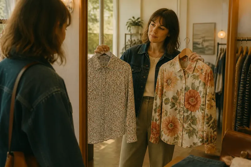
Say Mara is choosing a shirt for a relaxed gallery visit, followed by coffee with a friend. She likes florals, but wants the shirt to feel noticeable without becoming the only thing she sees in the mirror. She has a dark denim jacket and plain trousers ready, so she can assess the print without adding another pattern.
At a shop, Mara finds two floral shirts in a similar colour family. The first has small, closely spaced blossoms. At arm’s length, the motifs blend into a lightly textured surface; up close, their petals become clear. The second has large flowers with open space between them, so each bloom stands out immediately.
She tries each shirt on rather than judging the fabric swatches. In the mirror, the small print gives the outfit an even, fine-grained look. The large print directs attention to the shirt first, which is the stronger effect she wants for a special piece. She chooses it, then checks that the jacket does not hide the motif awkwardly at the shoulders or break one flower at an uncomfortable point.
The useful lesson is not that large florals suit Mara better. It is that she named the desired effect—noticeable, but easy to wear with plain layers—and compared both prints at the scale and placement they would actually have on her body.
Compare stripes, checks and florals at garment scale
Stripes are especially sensitive to direction and spacing. A narrow stripe repeated closely can read as a fine texture, while a broad stripe is more graphic. Vertical, horizontal and diagonal lines also lead the eye differently, so consider the stripe’s route across the garment as well as its width.
Checks combine several lines into a grid. Small checks can look almost like a solid colour from a distance; larger checks form distinct blocks that may feel more casual or more prominent. Notice whether the grid stays clear at the garment’s seams, pocket edges and folds.
Florals vary in both motif size and spacing. A large flower is not automatically a bold print if its colours are soft and its outlines low-contrast. Conversely, tiny high-contrast blossoms packed tightly together may create a strong, busy impression.
When comparing prints, hold the garment at the distance from which it is likely to be seen, then look closer. If the pattern changes from a clear motif to a nearly solid field, that shift is part of its character.
Choose the effect you want the pattern to create
Before choosing a repeat, finish the sentence: “I want this pattern to draw attention to…” The answer might be the whole outfit, a particular garment, or simply a detail that becomes visible at close range. This keeps the decision focused on expression rather than rules about which prints someone is allowed to wear.
- For a clear focal point: Try a larger repeat, stronger contrast or more open spacing, then see whether it competes with other noticeable details.
- For a quieter surface: Look at a smaller repeat or gentler contrast, while checking that the print still reads as intentional rather than disappearing.
- For a pattern that changes with distance: Compare it from across a room and at conversational distance; decide whether you like the shift from texture to motif.
- For a garment with prominent seams or shaping: Check how the repeat sits across those lines, since a cut can interrupt or redirect the pattern.
In Mara’s case, a larger floral repeat supplied the focal point, while the plain jacket and trousers gave it room to register. Had she wanted the shirt to blend quietly into a layered outfit, the smaller print might have been the more satisfying choice.
How can you judge pattern scale before choosing?
Does a larger print always look bolder?
Not always. Size, colour contrast, spacing and the garment’s shape work together, so a large, softly coloured motif may feel gentler than a dense field of tiny, sharply contrasted marks.
Will a small pattern look like a solid from a distance?
It can, especially when its motifs are close together. Step back from the mirror or view the garment across a room to see whether you prefer that blended effect or want the individual shapes to remain visible.
Can different pattern scales be worn together?
Yes, if you want both patterns to be noticed and they do not blur into one another. A useful starting point is to make one print clearly dominant and let the other play a quieter role, then check the whole outfit from a few paces away.
Where should you check a pattern on a garment?
Look at the areas where the print meets seams, collars, cuffs and pockets, as well as at the garment’s broadest visible section. Those spots reveal whether the repeat feels well placed or is unexpectedly interrupted.
Let the finished garment settle the choice
A pattern’s appearance on a flat swatch can change when fabric hangs, folds and moves. If you can, assess the full garment in a mirror, with the layers and plain pieces you expect to wear alongside it. If you are shopping online, use garment images to inspect motif size relative to buttons, seams or pockets rather than relying on a cropped close-up.
Pattern scale is a choice about visual emphasis, not a test of taste or proportion. When you want to choose pattern scale in stripes, checks and florals, decide where you want the eye to go, then look at the repeat on the actual garment. A small print can be quietly expressive and a large one can feel effortless; the right one is the one whose effect you enjoy seeing in your own outfit.